I have directed the brand identity of Lake Nona, winning the master-planned community in Orlando multiple design awards in the process.
I redefined the region with the modern LN. iconography approach and application.
LN. The Lake Nona Magazine - concept and design direction of the 64-page brochure that serves as both a B2B and B2C informational collateral piece.
The Latest Edition
Edition 7: The Human Performance Edition
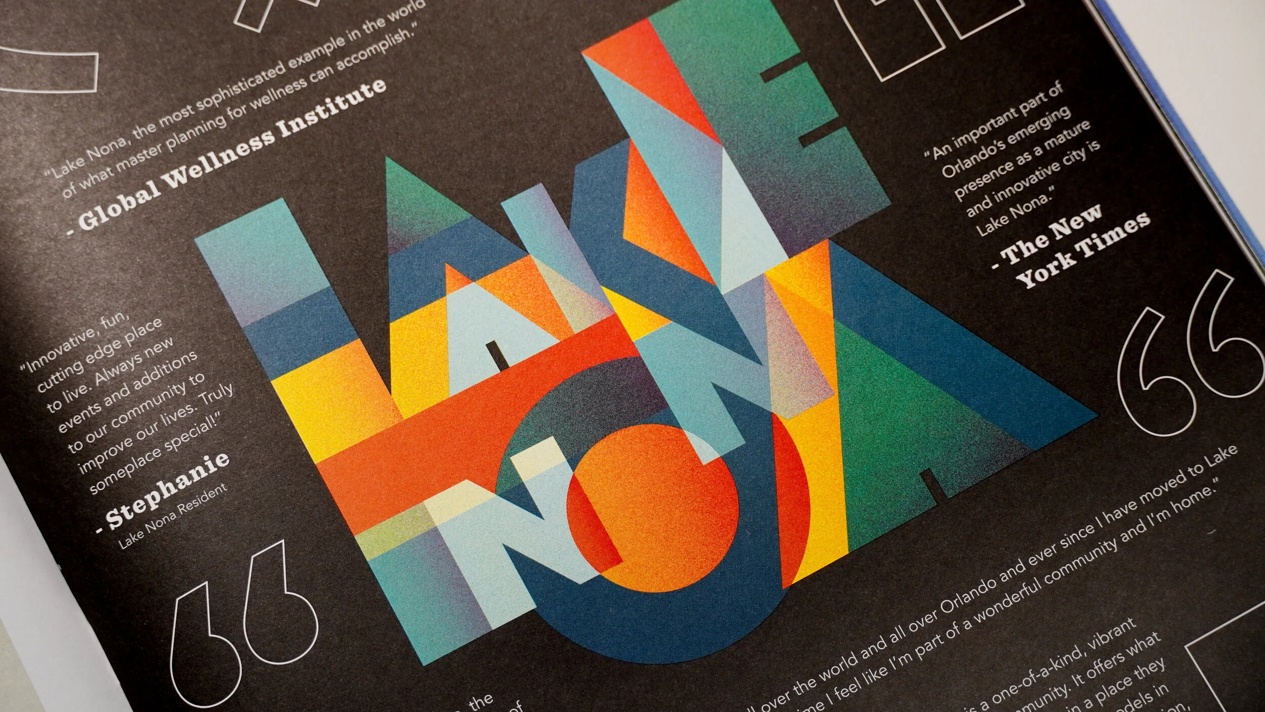
LN. The Lake Nona Magazine was built to replace the Lake Nona community brochure, a traditional residential marketing collateral piece. The team decided to create a digestible editorial-style magazine instead of a traditional brochure booklet to show off stories and aspects of the community. The front and back cover design portrays the vibrant community with a textured starburst, branded fonts, minimal yet bold typography, and a buffalo plaid use of branded colors. The interior articles of the magazine highlight some of Lake Nona’s premier assets: Art, environmental initiatives, and a wide range of activities. There is a consistency within the magazine with the use of fonts, colors, and layout to create visuals that flow seamlessly to any reader. The physical aspects of the magazine are comprised of an oversize dimension to draw attention and ease legibility, with uncoated interior pages to create a modern casual texture to the magazine.
Custom LN design based on the modern take of the Lake Nona brand that I designed.
Previous magazine editions


